


 Traffic Topology
This document was translated by ChatGPT
#1. Traffic Topology
The traffic topology in DeepFlow can be used to display the dependencies between services or resources, enabling better analysis and troubleshooting, such as identifying performance bottlenecks, single points of failure, or potential dependency access issues.
#1.1 Overview
00-Overview
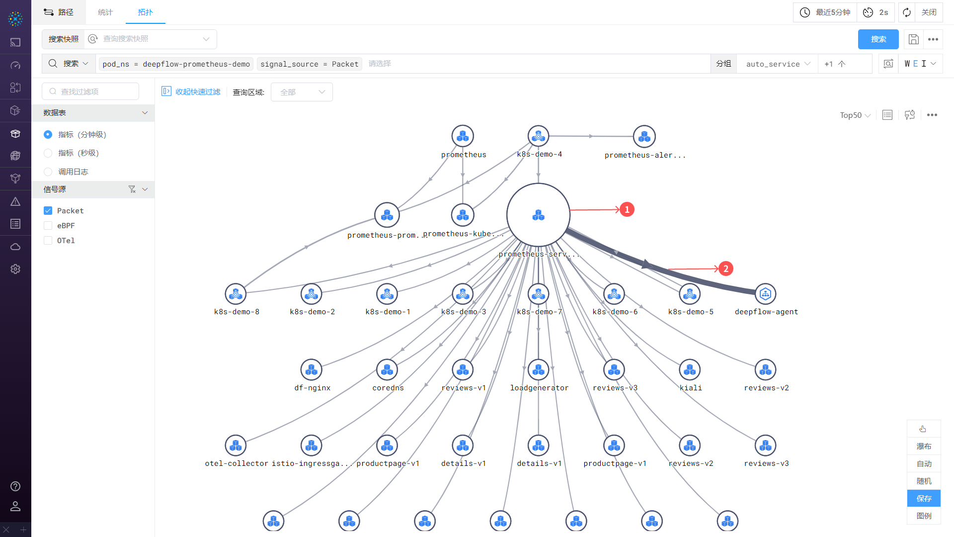
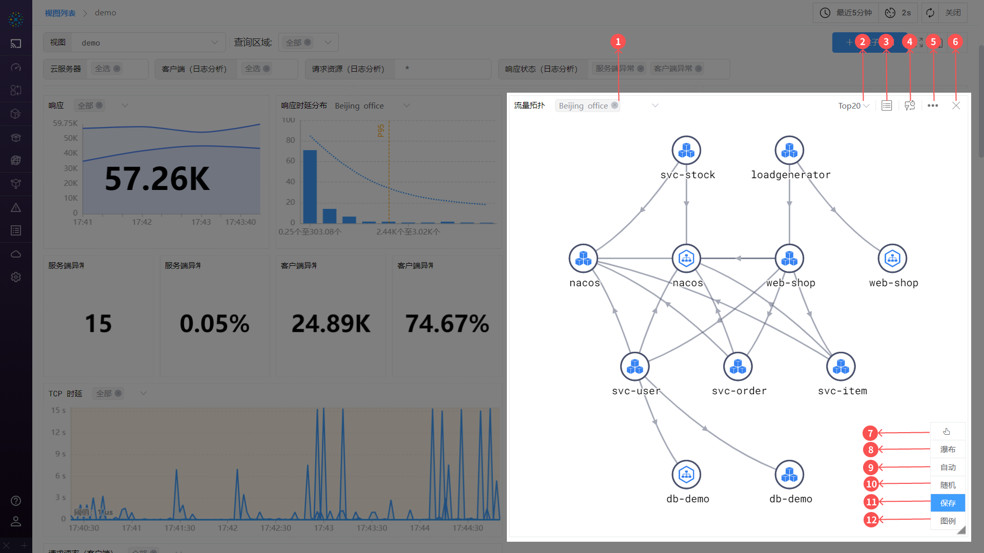
The traffic topology consists of nodes, paths, and several operations:
- ① Node: Represents a service or resource, corresponding to the
groupin the search criteria. It can be a container service, cloud server, region, etc. - ② Path: Represents the direction between services or resources, from
clienttoserver. - Operations: You can hover over or click on a
nodeorpath- Hover: Highlight the
nodeorpathand view metric values - Click: View details of the
nodeorpathin a right-side sliding panel
- Hover: Highlight the
#1.1.1 Topology Details
01-Topology
- ① Switch Query Region: If there are multiple storage regions for the data, you can quickly switch regions for querying
- Note: If the query criteria are not grouped, the
Switch TOP Datafunction is unavailable
- Note: If the query criteria are not grouped, the
- ② Switch Top Data: Sorts grouped nodes in descending order based on the primary metric value
- Note: If the query criteria are not grouped, the
Switch TOP Datafunction is unavailable
- Note: If the query criteria are not grouped, the
- ③ Expand Table: Click to expand or collapse the table. For details, see the Expand Table section
- ④ Modify Metrics: Allows you to change the displayed metrics. For details, see the Modify Metrics section
- ⑤ Settings: Click to configure the
traffic topology. For details, see the Settings section - ⑥ Delete: A
Dashboardfeature. If you do not want to display thistraffic topologyin the dashboard, click delete to remove it - ⑦ Manual Resource Relationship Mode: In this mode, you can manually add paths between nodes
- ⑧ Waterfall/Free Topology: Switch between topology display styles. Free topology is generally used for scenarios with many nodes and complex paths; waterfall topology is used for fewer nodes and simpler paths
- ⑨ Auto Layout: The system arranges nodes in a tree structure based on path relationships
- ⑩ Random Layout: The system arranges nodes in a star structure
- ⑪ Save Topology: A
Dashboardfeature. After modifying thetraffic topology, you can clickSave Topologyto save changes such as time range, topology position, topology configuration, and variable template values - ⑫ Legend: Open the legend to view the meaning of icons and lines. For details, see the Legend section
#1.1.2 Hover TIP

02-HoverTIP
When hovering over a node, the related paths are automatically highlighted. When hovering over a path, the related nodes are highlighted. At the same time, a TIP displays the metric values for different observation points.
#1.1.3 Hover Metric Display

03-HoverDisplay
Taking hovering over a path as an example, here is the TIP content:
- First line: Description and legend area. Legend explanation:
- Application Functions
- A Application: Metrics obtained via application instrumentation, currently representing
signal source = OTeldata - S System: Metrics obtained via eBPF, currently representing
signal source = eBPFdata - E Endpoint Network: Metrics obtained via traffic capture (BPF) from the NIC of the client or server
- M Middle Network: Metrics obtained via traffic capture (BPF) from locations other than the client or server NIC
- A Application: Metrics obtained via application instrumentation, currently representing
- Network Functions: All metrics come from traffic capture (BPF)
- D NIC: Data captured from the NIC of the client or server
- K Container Node: Data captured from the container node NIC
- H Host: Data captured from the host NIC
- M Middle Network: Data captured from NICs other than the above
- Corner Mark: Indicates whether the data collection point is on the client or server
- C: Client
- S: Server
- Application Functions
- Second line: Name of the hovered
node/path - Others: Metric display area
- Displays metric values based on the data location
- The last column shows the difference across all
observation points, useful for quickly identifying inconsistencies insent traffic - Example: As shown below, representing endpoint network data from the client

04-Icon
#1.1.4 Settings
Click the gear icon to configure the traffic topology

05-Settings
- Show Full Name: Display full node names or abbreviated names
- Download CSV Data: Download the data of the
traffic topology - View API: View the API information used to generate the
traffic topology
#1.1.5 Expand Table
Click the Expand Table button to display the metrics of nodes and paths in the traffic topology in a list format, including resource monitoring, path monitoring, and path difference tables.

06-Table
- Resource Monitoring: Displays metrics for all nodes in the
traffic topology - Path Monitoring: Displays metrics for all paths in the
traffic topology - Path Difference: Displays the differences in metrics for all paths across different
observation points - Search: Quickly search and locate table data
- Settings: Configure column width display, such as equal width or content-based width
#1.1.6 Modify Metrics
Metrics are an important part of the chart. DeepFlow provides shortcuts to quickly select metrics to display in the dropdown menu.

07-ModifyMetrics
- ① Metric Name: Select a metric name to display its data in the chart
- ② Set as Primary Metric: Click the icon to set the metric as the primary metric. When
Switch TOP Datais used, the chart is sorted by the primary metric value - ③ Advanced Settings: Add, delete, or modify metrics. For details, see the Advanced Settings section
- Multi-select/Single-select: Some charts support multi-select, where the TIP can display multiple metrics; single-select shows only one metric
#1.1.7 Advanced Settings
For further metric configuration, click Modify Metrics -> Advanced Settings to enter the settings page. As shown below, you can add or delete metrics, add aggregation functions, modify display names, set thresholds, and select metric templates.

08-AdvancedSettings
- ① Select Template: Choose a
metric templateto quickly switch the current metrics in the popup - ② Clear All: Clear all metrics in the popup
- ③ Save Template: Save the current metric configuration as a
metric template - ④ Metric Field: Click the input box to open a dropdown and select metrics by category
- Aggregation - Primary Operator: Aggregate metrics using functions such as average, sum, max, min
- Aggregation - Secondary Operator: Perform secondary calculations on data from the
primary operator - Name: Set the display name of the metric
- Unit: Set the display unit of the metric
- Threshold: Set a threshold for the metric. When exceeded, the
nodeorpathturns red as an alert
- ⑤ Enable/Disable Metric: Show or hide the corresponding metric
- ⑥ Add Metric: Add a
④ Metric Fieldin the popup
#1.1.8 Edit
The topology editing panel consists of three parts: ① Chart, ② Search Criteria, and ③ Style & Settings.

09-Edit
- ① Chart: The chart is drawn based on
② Search Criteriaand③ Style & Settings - ② Search Criteria: For usage, see the Search section
- ③ Style & Settings: Configure chart styles, colors, etc.
- Style: Rich options for chart styling
- Title: Modify the chart name
- Chart Style:
- Show Full Name: Display full or abbreviated node names
- Show Primary Metric: When enabled, displays the primary metric value on paths
- Disable Thumbnail: Enable/disable the thumbnail view
- Step Line Bend Point: Set the position of bend points in step lines
- Area Fill: Fill the area between the line and the axis with color
- Data Stacking: Display multiple data series stacked or tiled
- Stacked: Stack values of multiple series in the same coordinate system to show overall trends and contributions
- Tiled: Display multiple series side-by-side to better show differences and relationships
- Color: Configure path and node colors
- Style: Rich options for chart styling
#1.1.9 Legend
Click Legend to view the meaning of icons and lines.

10-Legend